How can I match my wall color to carpet?
How to choose the colour of your carpet
The choice of which colour carpet to have will be based on several factors, including:
- Does it need to hide stains?
- The mood you wish to create
- Does it need to create a sense of space?
- The décor of the room it is in
Matching colours
Colours can be separated into three categories:
- The building blocks for all colours — red, yellow, blue.
- The result of combining primary colours — green, orange, purple.
- The shades produced when primary and secondary colours are mixed.
How to Match Carpet Colors and Paint Colors
Matching paint and carpet colors requires patience and a bit of perseverance. The problem begins with the paint chip. It only provides you with a minimal view of the color, which changes once it’s on the wall. The reason for this effect is metamerism — it happens when you put on two seemingly alike dark-colored socks in the morning under one type of light, only to discover that you have one blue and one black sock on when seen in the light of day. Take the time to match paint color choices to your carpet under all types of lighting so you’ll be pleased with the final results.
Natural Light Effects
The amount of natural light in a room affects color perception and causes subtle changes to wall and carpet colors as the sun moves during the daylight hours. Light also intensifies or lessens based on which direction the windows face in the room in relationship to the sun’s arc across the sky. Rooms with north-facing windows receive a hint of blue light, accentuating a blue carpet and pale blue walls, while west-facing rooms receive the warm oranges produced by the sunset glow, which can saturate yellows, oranges and reds in the carpet and on the walls. Rooms that face east get a dose of green, making these colors appear more vibrant, while south-facing rooms receive the most intense, bright light of them all, which shows up marked differences between shades, tints or tones.
Testing Color Choices
Bring a sample of the carpet with you when you begin the selection of paint chips and colors to narrow down your choices immediately. Compare them inside the store’s bright lights and in the direct light outside for a truer match. After selecting multiple paint chips in varying shades, tones or tints of your color — celadon green for walls for a sea-foam green carpet, for example — bring them home and hang them on the wall in the room where you plan to add them. But first, hold them against the carpet sample for a comparison inside the home. Periodically check the paint chips at various times of the day in the room to notice the changes. Narrow your selection down to one or two colors.
Paint Samples
Pick up two or more small paint samples. The minor cost is nothing compared to having to paint your room twice to get its color matched to your carpet. Select an area of the wall exposed to the natural light in the room. Paint a 1-by-2-foot area, next to the carpet — don’t forget to tape it off to prevent drips — with the colors separated by a few inches, but basically side by side. Live with these colors on the wall for a few days or weeks – however long it takes — to find the one that works the best for the carpet. You can watch how the light changes the paint’s color directly and avoid costly redos.
Follow the “Rule of Three.” In interior design
The “Rule of Three” dictates what is aesthetically pleasing in design schemes. The use of harmonious colors throughout furniture and décor instantly brings the entire space together. For example, using three coordinating shades of the same color on the three largest objects in the room, such as the carpet, the walls, and the curtains, can easily create a cohesive design. For the ultimate in relaxation, use a grey-blue color scheme, matching a blue toned carpet with a light blue-grey wall color. Compliment these two colors with medium blue and white patterned curtains, keeping the room monochromatic in tone and following the “Rule of Three!”
Multicolored Neutral Carpets
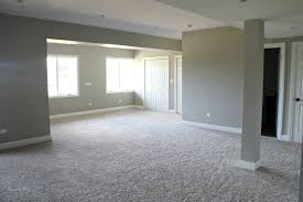
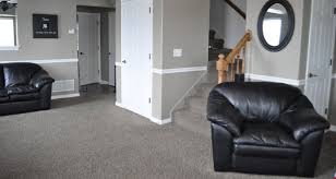
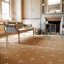
In new homes or remodeling projects, start from the ground up with carpeting. Neutral colors are a good choice for carpeting as they allow more flexibility with wall color, furniture and accessories. Multicolored neutrals with small flecks of color also help camouflage stains and spills. Pick one of the color flecks for use as the wall color. The most common multicolored neutral is beige carpet with flecks of light and dark brown. This carpet complements a range of warm neutral paint colors such as wheat, tan, coffee and gray hues with brown undertones. Warm yellow and gold walls would also work. Earthy greens and shades of blue look especially good with light and dark brown. Strong hues for accent walls include burnt orange, burgundy, chocolate brown and charcoal gray.
Tips
- If choosing colors is difficult for you, consult a color selection tool on a paint company’s website, or ask an informed representative at a paint store.
- To streamline the painting process, use an all-in-one primer and paint, which allows you to skip the priming step.
- It’s important to prime walls, if using regular wall paint, before testing a new paint color, unless the walls are already white or light. If the new paint color is tested on a dark, nonprimed wall, the new paint color won’t be an accurate representation of its true color, as the old dark color may show through.